
Each Analytics report will look different, but they will all have ways for you to dig deeper into the data and view it in different ways.
The top of the report will have a variety of drop-down lists that allow you to narrow the data shown.
Figure 1: Top of Report Drop-down Lists
In the top corner of the drop-down lists, you will see a Clear Selections icon that will allow you to quickly remove any selections for the drop-down list.
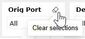
Figure 2: Clear Selections Button
In the middle of the report will be all the charts and tables of data. As you hover your cursor over sections of the report, you will see icons appear that will give you more options.
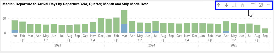
Figure 3: Report Icons for more options
Depending on the chart or table, you will see options to:
The bottom of the report will have additional tabs to details or more explanation.
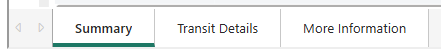
Figure 4: Bottom Tabs